
Save the Bay:
Signage & Public-Facing Design
Type: Environmental Design, Public Communication, Branding Systems
Role: Communications & Graphic Design Intern
Solo/Team: Team Collaboration (Design Execution & System Support)
Timeframe: Summer 2025
Tools: Canva, Adobe InDesign, Google Suite, Print Media
Designing for Public Access, Education, and Advocacy
As a Communications and Graphic Design Intern for Save The Bay, I worked on a wide range of signage and communication materials that supported the organization’s mission across physical and digital spaces.
This work extended across multiple environments, including Rhode Island shorelines, the Save The Bay aquarium, social media platforms, and government-facing communications. Rather than focusing on a single project, my role involved contributing to a broader visual system that needed to remain consistent, accessible, and adaptable across different contexts.
From wayfinding signage to social media graphics to printed advocacy materials, each piece played a role in how the public interacts with and understands Save The Bay’s mission.
The Problem
Save The Bay operates across many touchpoints, each with different audiences and needs. Some materials are viewed outdoors in coastal environments, while others are experienced in educational spaces like the aquarium or through digital platforms.
Because of this range, maintaining clarity, consistency, and accessibility across all materials can be challenging.
Key challenges included:
Updating outdated or deteriorating signage while preserving recognizability and making new signage that fits our brand guidelines. This was especially important for our aquarium, as it is still new.
Designing for multiple environments (outdoor, indoor, digital, print)
Communicating clearly to a wide public audience with varying levels of familiarity
Maintaining brand consistency across unrelated but connected materials
Designing materials that are both functional and mission-driven
My Approach
I approached this work as part of a larger visual communication system, rather than treating each deliverable as an isolated design.
Each project required balancing clarity, usability, and brand consistency while adapting to its specific context, whether that meant readability outdoors, engagement on social media, or clarity in printed advocacy materials.
My approach included:
Prioritizing clarity and accessibility in all public-facing designs
Maintaining consistency with Save The Bay’s established visual identity
Adapting layouts and formats based on environment and audience
Designing with long-term use and durability in mind (especially for signage)
This mindset allowed me to create work that functioned effectively both individually and as part of a cohesive system.


Development Process
My work spanned several projects, each contributing to a different aspect of Save The Bay’s communication and outreach efforts.
Shoreline Public Access Signage Update
I recreated and updated shoreline access signs that had originally been installed decades ago. Since no digital files existed, I rebuilt the design from scratch while preserving its original look and recognizability.I also standardized the layout and integrated QR codes in a consistent and intentional way, ensuring they were easy to scan without interfering with the design or physical structure of the sign. These updates help improve accessibility and usability for the public while maintaining continuity with existing signage.
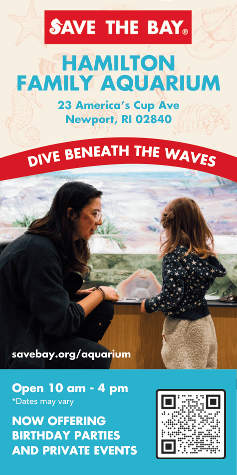
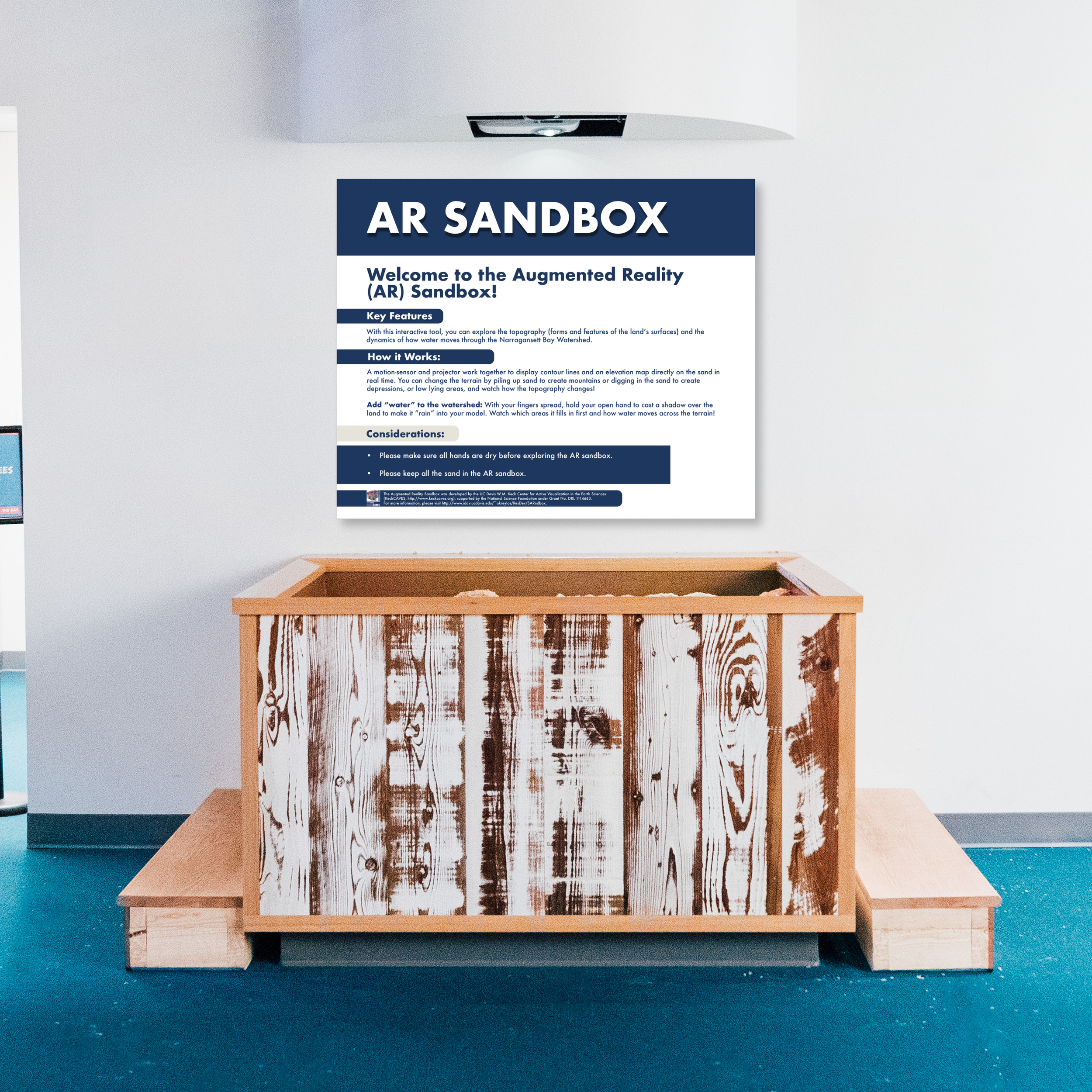
Aquarium Signage (AR Sandbox Exhibit)
I designed the first signage for a newly installed AR Sandbox exhibit at the Save The Bay aquarium. The goal was to create a piece that felt like a natural extension of the existing exhibit system.This required carefully matching materials, layout style, and tone so the signage integrated seamlessly into the space.
Social Media Graphics (Aquarium Updates)
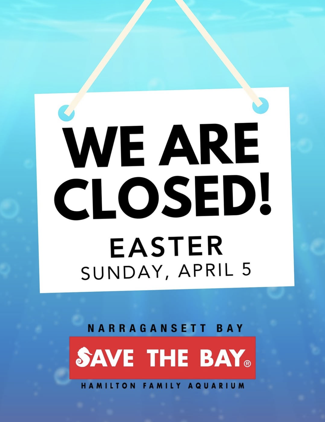
I created graphics to communicate aquarium openings and closures, ensuring that important updates were clear, timely, and visually consistent with the organization’s brand.
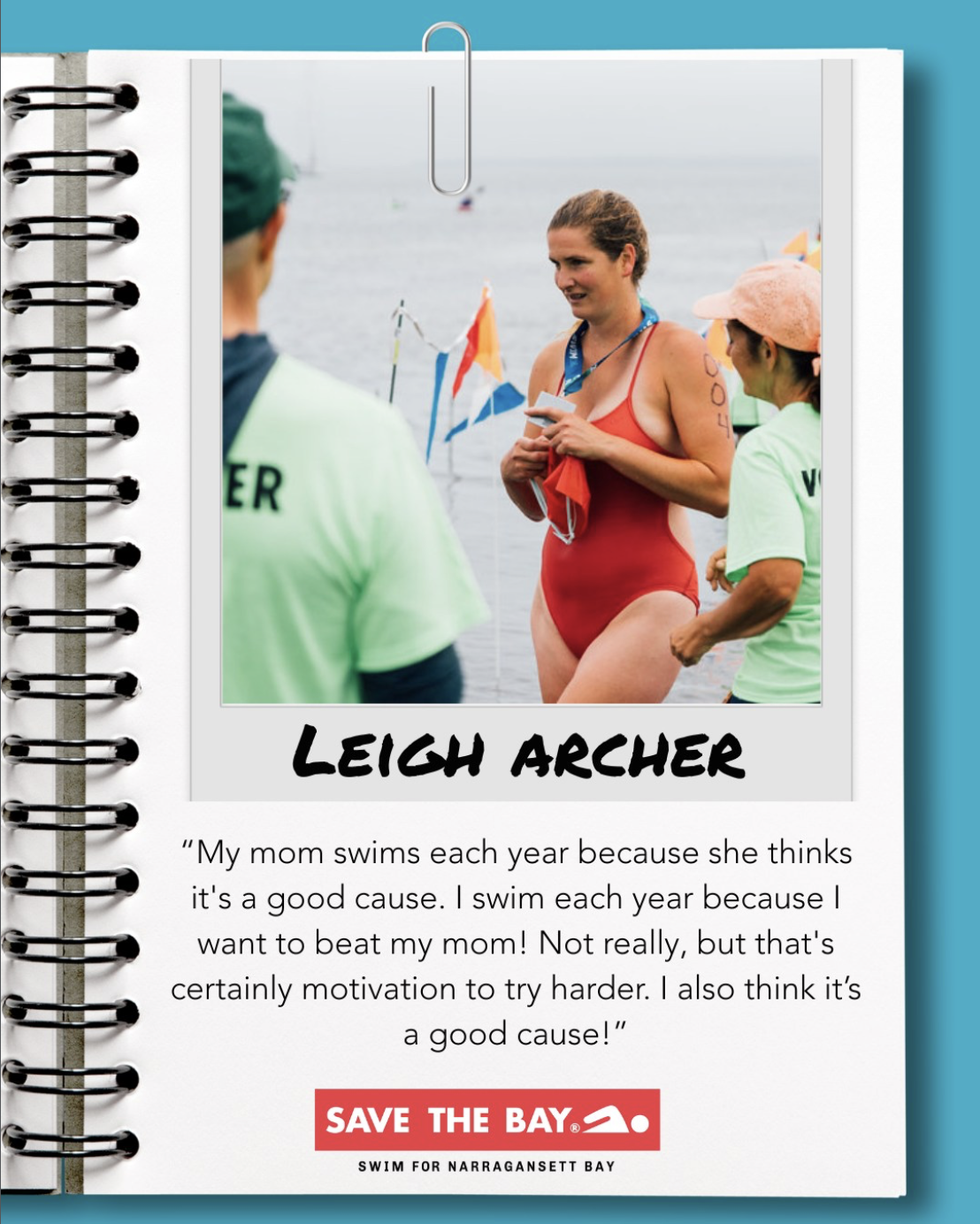
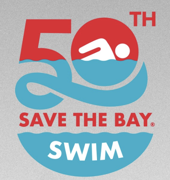
50th Swim Anniversary (Content Formatting & Concept Support)
I helped format and organize “50 Weeks of Swimmers,” a campaign celebrating the 50th anniversary of the Save The Bay Swim.In addition to layout work, I contributed early ideas and feedback for the 50th anniversary medal design and logo, supporting the initial concept development process.
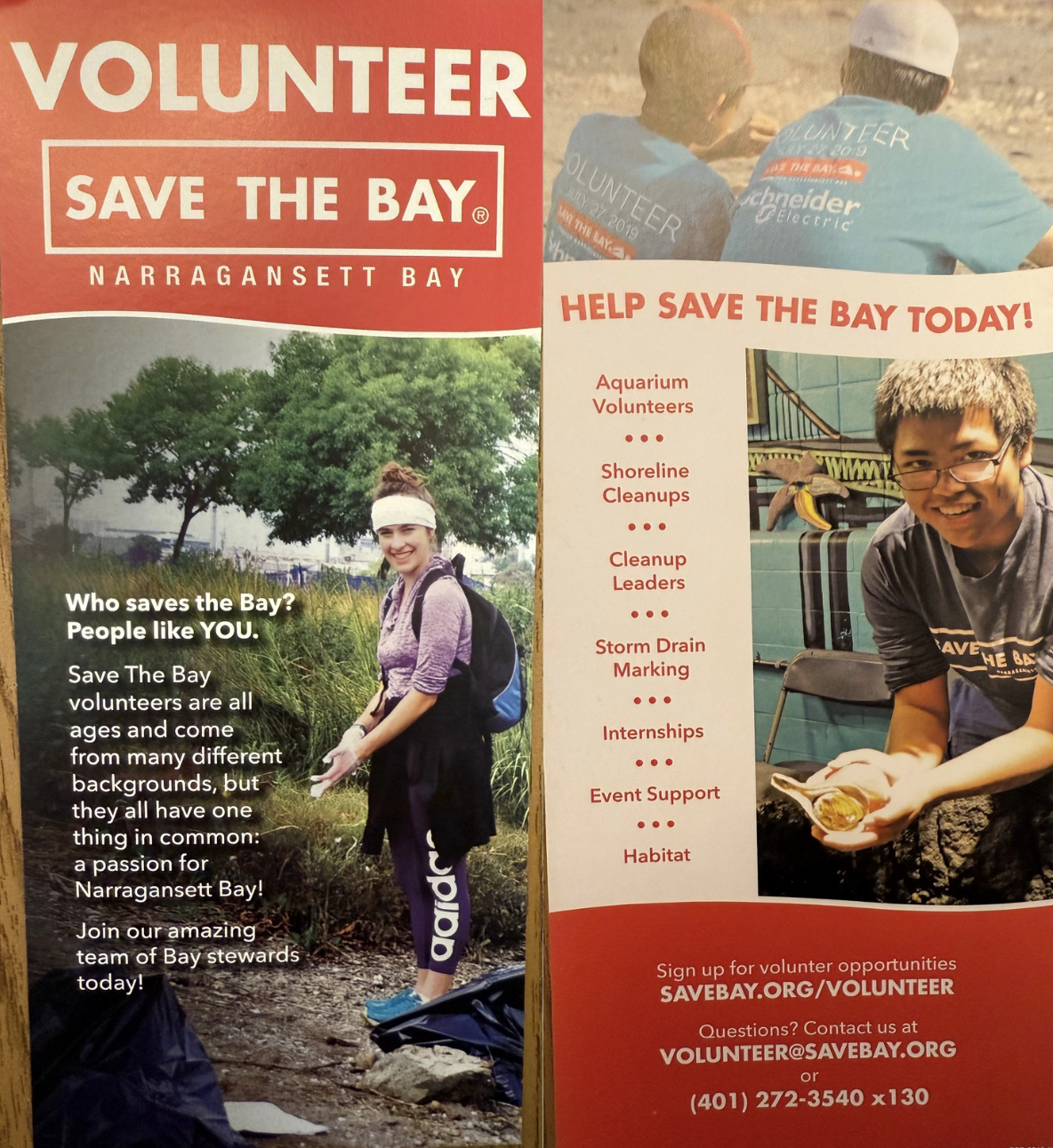
Newspaper Advertisement Design + updated Rack Cards
I designed a print advertisement to promote Save The Bay’s initiatives, requiring a balance between strong visual impact and clear, concise messaging. I also updated our volunteer and membership rack cards, as much of the information was outdated.
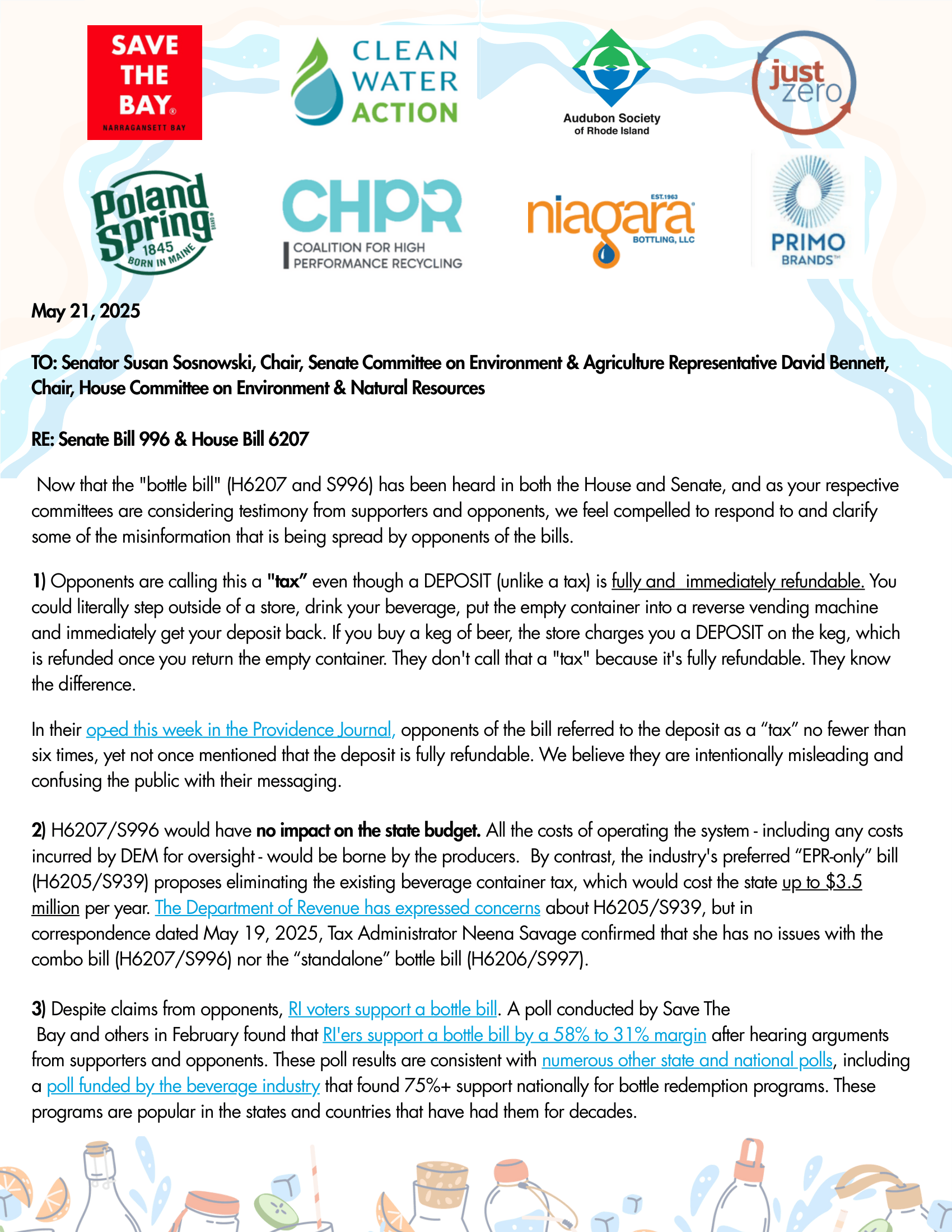
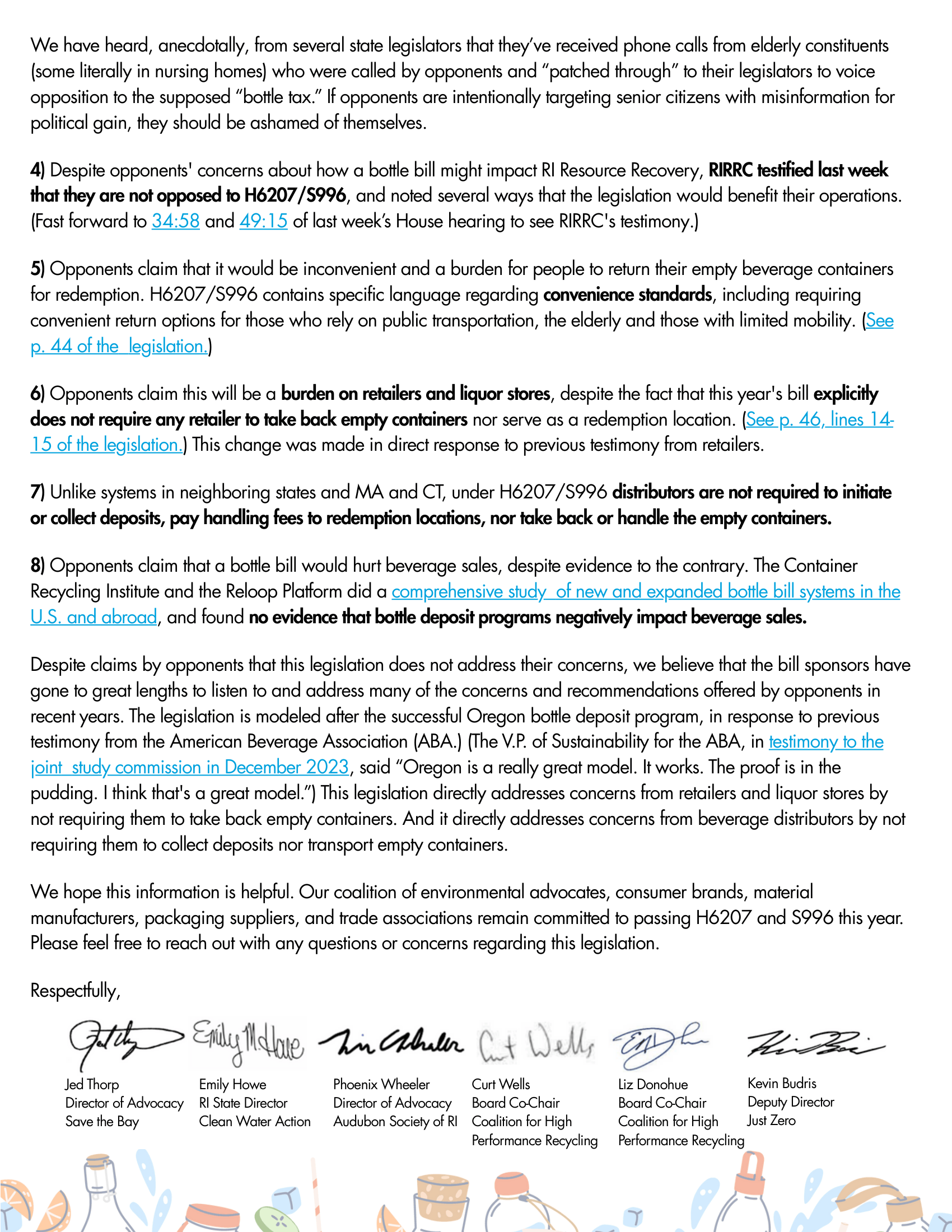
Government-Facing Documents
I created formatted documents intended for government audiences to support advocacy efforts. These materials needed to communicate information clearly and professionally while reinforcing the organization’s mission.


What I Created
This body of work resulted in a diverse set of materials that supported Save The Bay across multiple platforms and environments:
Shoreline Access Signage:
Recreated and standardized public access signs for coastal locationsAquarium Signage:
AR Sandbox exhibit signage designed to match existing systemsSocial Media Graphics:
Aquarium open/closed updates and informational postsCampaign Content (50th Swim Anniversary):
Formatted weekly swimmer features and contributed to early design conceptsPrint Advertisement:
Newspaper ad promoting organizational initiativesAdvocacy Documents:
Designed materials for government communication and outreach


Results
The work contributed to a more consistent and functional visual presence across Save The Bay’s public-facing materials. Updated signage improved clarity and accessibility in coastal areas, while new designs supported engagement in both educational and digital spaces.
These materials helped:
Improve usability and readability of public signage
Maintain a cohesive brand across multiple platforms
Support outreach and advocacy efforts through clear communication
Contribute to long-term campaigns and organizational initiatives
Reflection & Next Steps
This experience strengthened my ability to design within an existing system while adapting to a wide range of contexts. It required thinking beyond aesthetics and focusing on how design functions in real-world environments, from outdoor signage to educational spaces to digital communication.
One of the biggest takeaways was learning how to balance consistency with flexibility. Each project had different constraints, but still needed to feel like part of the same overall system.
If I were to expand on this work, I would explore:
Developing a more formalized signage and visual system guide
Expanding accessibility considerations across all materials
Creating more modular templates for recurring communication needs
Overall, this work reinforced my interest in designing for public impact, where clarity, accessibility, and consistency play a key role in how people engage with information and environments.
